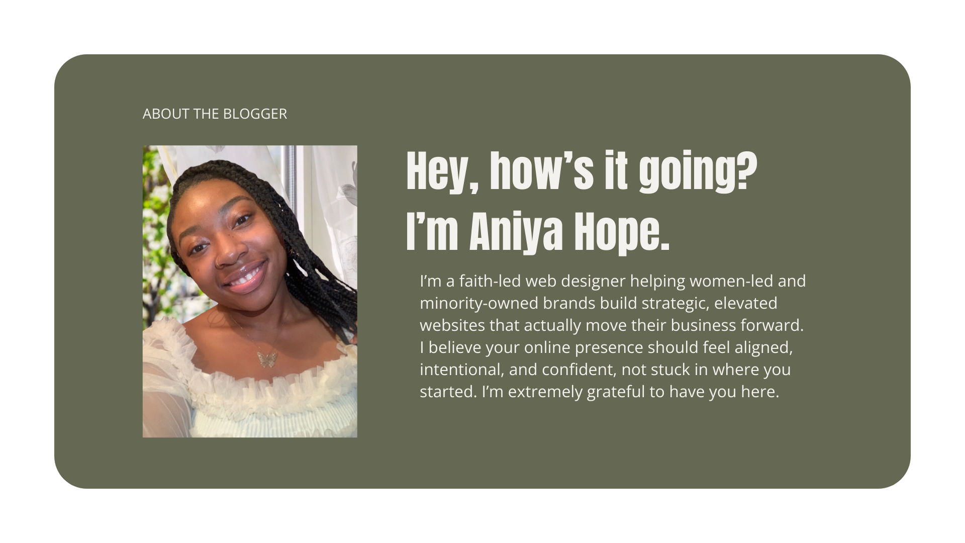
5 Website Flaws That Are Quietly Costing You Clients
You don’t need more traffic.
You need a website that converts the traffic you already have.
If you’re a woman-led brand growing your business, your website shouldn’t just “exist.” It should clarify your value, build authority, and guide people confidently toward working with you.
But here’s what happens often:
You tweak.
You update fonts.
You swap photos.
You rewrite sections.
And still… inquiries feel inconsistent.
If you’re wondering what’s up, I’ve got ya! Keep reading to find out the five website flaws I see constantly, especially on growing service-based brands, and learn what to do about each one.
1. Your Homepage Is Clear to You, But Not to a Stranger
You know the ins and outs of your business because… well… it’s your business. You’ve spent months, maybe years, thinking about it. Refining it. Talking about it. Living inside it. You know why you chose that niche. You know what makes your process different. You know what your clients struggle with before they even say it out loud. It’s second nature to you now.
But here’s the deal, your ideal client does not know any of that. Yet. They’re not inside your head. They haven’t followed your entire journey.They didn’t sit with you while you reworked your offers or pivoted your messaging. They’re landing on your website cold and clueless.
And in those first few seconds, they’re subconsciously asking:
What does she do?
Is this for someone like me?
Why should I care?
What am I supposed to do next?
They’re not analyzing your brand strategy. They’re most likely just scanning. If your homepage says something like: “Helping you step into your next level.” It sounds inspiring. It might even feel aligned to you. But the truth is, unfortunately, it’s weak. Really… why? Well, because though it may sound nice and like something “attention-grabbing”, it’s vague. So vague that it doesn’t mean anything. “Next level” of what? For who? How? Can you actually prove that? Vague messaging doesn’t repel people dramatically. It just quietly confuses them. And confused people don’t convert.
What to Fix (Without Overhauling Everything)
Instead of trying to sound elevated or clever, aim for clarity. Clarity is powerful. Clarity feels confident. Clarity builds trust. Here’s a simple structure you can apply today:
Headline: The outcome you help achieve
Subheading: Who it’s for + how
Button: One clear next step
That’s it.
Take a look at this example:
Strategic Website Design for Women-Led Brands
Custom websites built to support your next level of growth
[View Services]
See the difference? There’s no guessing. No decoding. No “wait… what does she mean?” It answers the four core questions immediately: What does she do? → Strategic website design. Who is it for? → Women-led brands. Why does it matter? → It supports growth. What should I do next? → View services.
Straightforward.
And here’s the thing most people don’t realize, when your messaging is clear, your website doesn’t have to work so hard visually. You don’t need flashy animations. You don’t need ten sections explaining yourself. Clarity reduces friction. And friction is what quietly costs you clients. Because when someone feels understood quickly, they stay. When they stay, they read. When they read, they trust. And when they trust, they inquire. Clarity builds trust. Trust builds conversions.
And sometimes the most strategic thing you can do for your website isn’t redesign it, it’s rewrite the first 10 words.
2. Your Website Has No Strategic Flow
Let me paint a picture. You open your laptop. You pull up your website. And technically… everything is there. You have a homepage. An about page. A services page. Maybe a portfolio. Maybe even a blog. It’s not empty. It’s not broken. It’s not ugly. But something feels… off. When you scroll through it, it kind of feels like a collection of sections you added over time. You needed testimonials, so you added them. You wanted to explain your process, so you inserted a section. You thought a banner would look nice, so you placed one there. Someone told you to add a lead magnet, so now that’s on the homepage too.
And slowly, your website became a digital brochure. Everything stacked. Everything technically present. But no intentional journey. Here’s the difference most people don’t talk about:
A brochure presents information.
A strategic website guides decisions.
When someone lands on your homepage, they aren’t there to explore randomly. They are there to answer one question: “Is this for me?” If your homepage is offering visitors to “View services”, “Read the blog”, “Join the email list”, “Follow on Instagram”, “Download a guide”, “Book a call” …all at once, it may feel busy. And when everything feels important, nothing feels important. This goes back to confusion again. Confusion doesn’t create excitement. It creates hesitation. Hesitation kills momentum.
Let’s slow this down.
Ask yourself honestly: Does your homepage guide visitors toward one main action? Is there a clear path from homepage → service → inquiry? Or are you hoping they click around until something sticks? Because here’s what strategic flow actually looks like: Someone lands. → They understand what you do. → They see themselves in your messaging. → They understand the offer. → They know exactly what to do next.
No guessing. No wandering. No mental effort. That’s flow.
What to Fix (Without Burning It All Down)
So, to fix this, you don’t need a complete overhaul right away. You just need clarity on the visitor’s journey of your site. It’s 4 simple things to make sure you lay out for visitors of your site.
1. Awareness
Who you are + the problem you solve. This is where they think, “Oh. She gets it.”
2. Authority
Why you’re credible. Proof. Experience. Specificity. This is where they think, “Okay… I trust her.”
3. Offer
How you help. Clear breakdown of services or solutions.This is where they think, “This is what I need.”
4. Action
What to do next. One primary step. This is where they think, “Alright. Let’s do this.”
That’s it. Not a gazillion different directions. Just one intentional path. Purposeful and moving someone forward.
Here’s a simple test:
If someone asked you, “What is the exact journey someone takes from landing on your homepage to becoming a client?” Could you describe it in one clear sentence?
If not, that’s not a design issue. That’s a structure issue, and structure is strategy. When your website has flow, something shifts. Visitors feel guided instead of overwhelmed. They have clarity and are more likely to move forward instead of clicking away. That’s when your website stops being a brochure and starts becoming an asset.
3. Your Website Reflects Where You Started, Not Where You Are
This one is so extremely subtle and overlooked! Your business has grown and improved. Your prices have increased, but your website still looks like it did two years ago. No updates. No nothing. That really can be a hard hit on your professionalism as a business. Your design doesn’t have to be extravagant and completely on par with the latest trends in design, but it does need to be accurate and up to date to reflect the current status of your business.
Otherwise, when visiting your website, a potential client could assess it and legitimately think, “Are they even still in business?” Ouch! You don’t want that, and I don’t want that for you, so let’s get into easy fixes for this.
What to Fix
Audit for alignment:
Are your fonts consistent across every page?
Do your images match your current brand tone?
Does your homepage reflect your current positioning, not your startup phase?
Does your design visually support your pricing level?
Sometimes this is a refinement. Sometimes it’s a full repositioning. But before you jump into redesign mode, there’s something even more important.
Audit for accuracy, open your site and check:
Is your contact information current?
Are your social links correct?
Are your service descriptions up to date?
Are you still listing offers you no longer provide?
Do your prices reflect your current rates?
Are your booking links working?
Are your testimonials recent or from three years ago?
This is the part many people skip. Because it’s not glamorous. But it matters. You would be surprised how often old packages remain listed, pricing remains outdated, broken links quietly block inquiries, and services are described in a way that no longer fits the business.
Imagine a client is ready to invest and they see pricing that doesn’t match what you actually charge now. That’s confusing and can cause hesitation. When someone is about to spend money, they are looking for signals of accuracy. Updated information signals, “I’m active.” Outdated information signals, “This might not be maintained.”
Even if that’s not true!
4. Your Website Talks About You More Than the Client
This is also extremely common! You describe your passion. Your journey. Your process. But, your visitor is thinking, “How does this help me?” Your website should feel client-centered, not founder-centered.
Instead of: I love helping women build their dreams.
Shift to: If you’re building a business and need a website that supports your growth, here’s how I help.
What to Fix
Go through your homepage and count how many times you say “I” versus “you.” Then, do a bit of reframing of sections to:
Speak directly to your ideal client’s problem
Show you understand their challenges
Position your service as the bridge
This shift alone can dramatically improve engagement.
5. You’re Fixing Surface-Level Things, Avoiding Strategic Decisions
This is the big one. You keep changing colors, adjusting spacing, testing different photos, and rewriting small sentences, but you’re avoiding addressing the important questions. Is my positioning clear? Is my offer structured correctly? Is my website built for the level I want to reach?
Design tweaks aren’t going to solve strategy gaps. And even the most beautifully designed templates, while powerful and a satisfying touch, can’t decide your brand direction for you.
What to Fix
Let’s zoom out and ask the right questions.
Ask:
What level of business am I building toward?
Does my website support that level?
Am I editing… or designing intentionally?
Sometimes the answer is a refined template. It can also be strategic support. Sometimes it requires a custom build. In most situation, it’s a combination of a multiples. The key piece to the puzzle is that clarity on your problem areas will always come first! So, you HAVE TO take the time to do the mundane and tedious work.
The Real Question: So, Have You Outgrown Your Website?
Outgrowing your website isn’t failure. It’s natural progression. Every growing brand hits a point where DIY adjustments stop creating real progress. And that’s not because you’re incapable. It’s because website structure, conversion metrics, and brand positioning are strategic disciplines, not just aesthetic choices.
A Practical Next Step You Can Take Today
Instead of guessing what needs fixing, run your website through a strategic filter. You can start assessing:
Is my messaging instantly clear?
Is my website guiding visitors intentionally?
Does it reflect my current level?
Does it convert or just exist?
If you want something more structured than self-questioning, I created a Strategic Website Growth Checklist for Women-Led Brands. It walks you through what you can confidently adjust on your own, what acts as a signal that you’ve outgrown DIY, and how to decide between refining a template or investing in custom strategy. It’s practical.
And it will give you clarity in under 10 minutes.
The goal isn’t just to “have a website.” It’s to have a website that supports your growth. I really want that for you!
Are you ready to get started?